I collaborated on this project with photographer Blair Bunting and Brooke West and Bill Robbins of Riester where I made it look like people were working out with the client’s logotype.
Blair Bunting shot a series of gritty, monumental photographs for an EōS Fitness ad campaign. It was a pleasure to work with the huge 11,600 x 8,700-pixel files Blair produced with his Hasselblad camera. The quality and detail of the photographs were incredible! My challenge for the project was to swap out fitness equipment with the client’s logotype so that it made the athletes look like they were jumping on it, bench pressing on it, and lifting it like a kettlebell or medicine ball. My solution was a combination of removing the fitness equipment in Photoshop and creating 3D renderings of the EōS Fitness logotype in Cinema 4D.
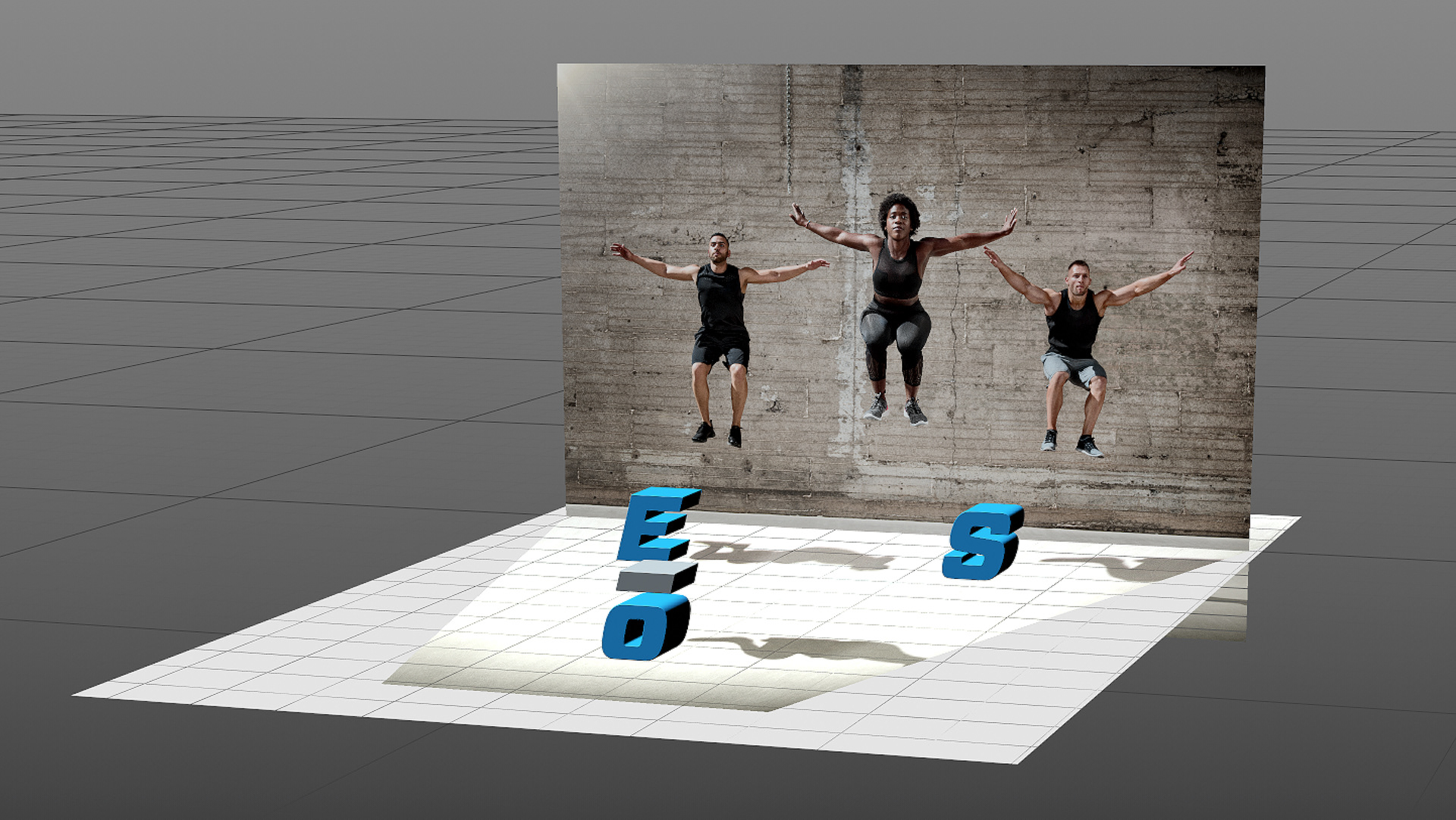
To capture realistic reflections on the logotype of the wall and floor of the photograph, I made a wall and floor in the 3D scene and then projected the photograph onto them.
I made a 3D model of the logotype and a blue, textured-metal surface for it. To successfully pull off the effect of the logotype in the photograph the perspective of the photograph would have to be matched. I made a 3D scene where I carefully matched the camera focal length, camera angle, and camera position of the original photograph.
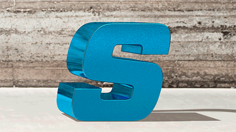
This short animation demonstrates how the sides of the logotype reflect the floor and the wall in the photograph, making the logotype more convincing.
After the 3D modeling and perspective-matching were complete, the logotype needed to be lit to match the photograph. Since the logotype is a shiny surface, it was more about placing surfaces around the logotype that would reflect in it. I found I could create nearly all the reflections by making a floor and wall in the 3D scene and then projecting the photograph onto them. The reflections on the fronts of the logotype were made by placing flat surfaces in the 3D scene that would reflect onto them. The flat surfaces had gradients applied to them that were easy to customize for the right look.

I carefully blended the shadows of the new logotype with the existing shadows in the photograph.
For all my projects, the skills I have gained from years of photo retouching are critical to making an excellent image. For the above image, I analyzed the original photo to see what the characteristics of the shadows were (such as color, color variation, texture, reflection, and edge softness). After compositing the rendered shadows of the logotype into the original photograph in Photoshop, I made extensive adjustments to them to match these characteristics.
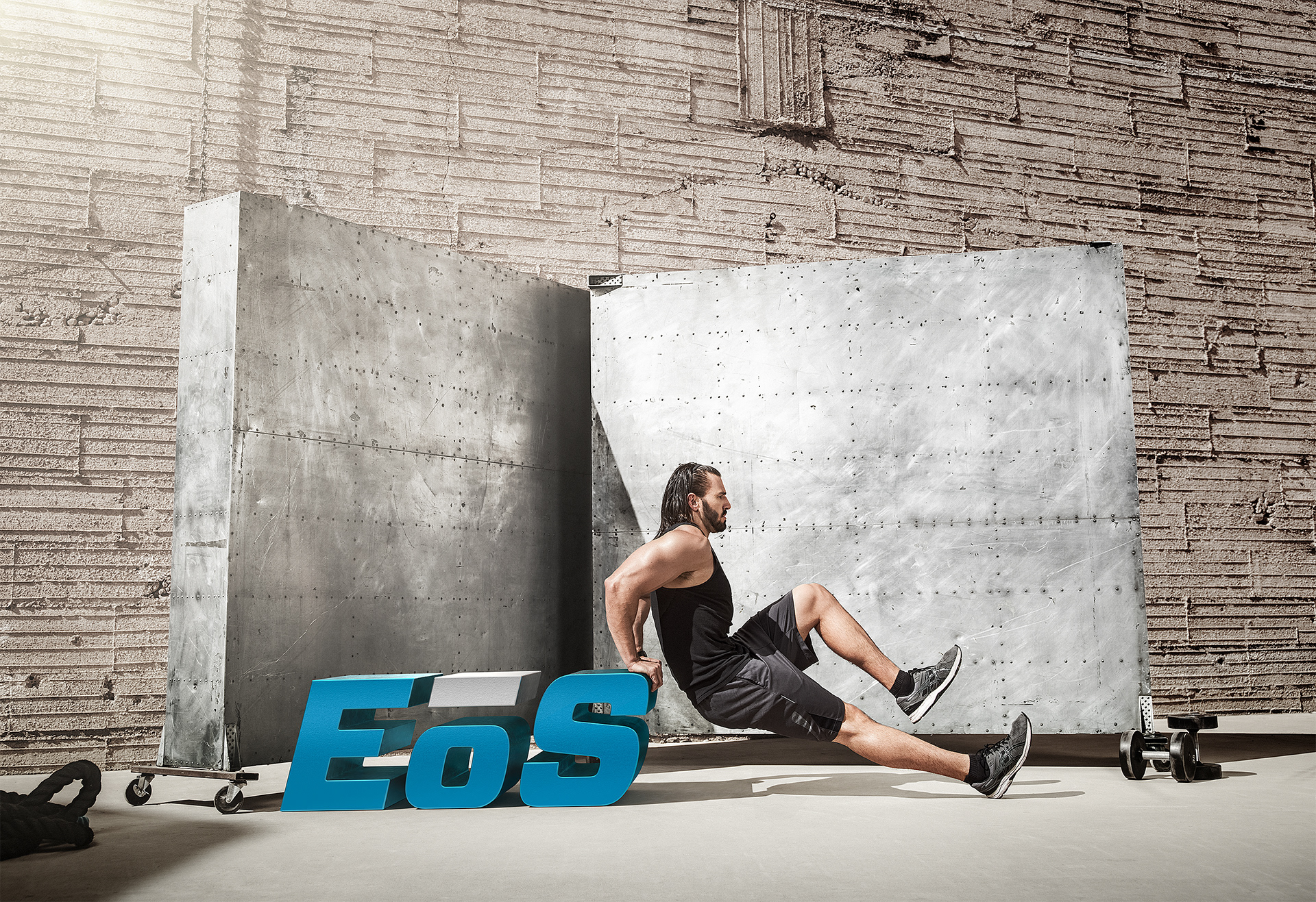
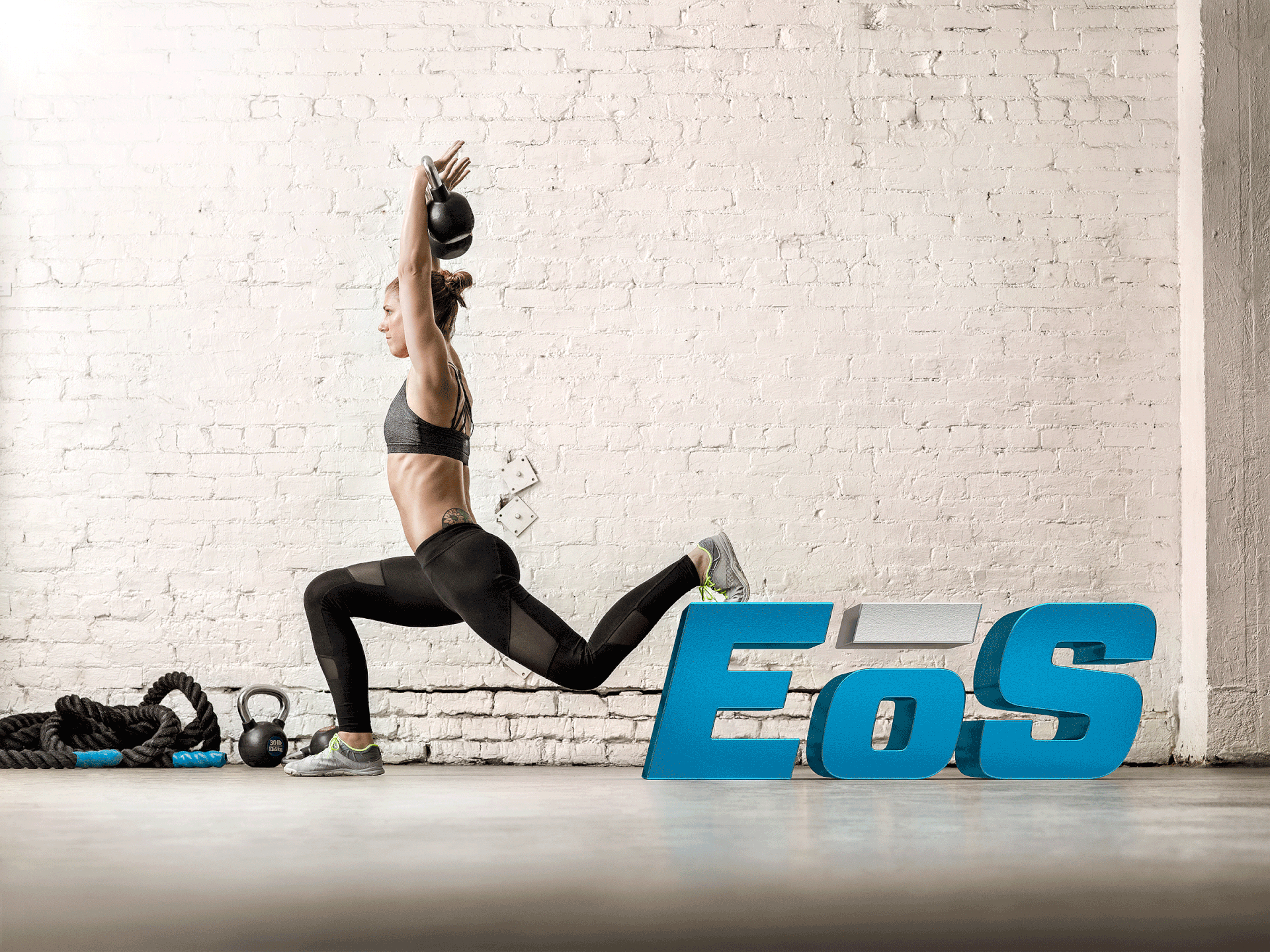
I removed the original fitness equipment from the photographs and once the logotype was inserted, I meticulously masked and fitted parts of the people to it.
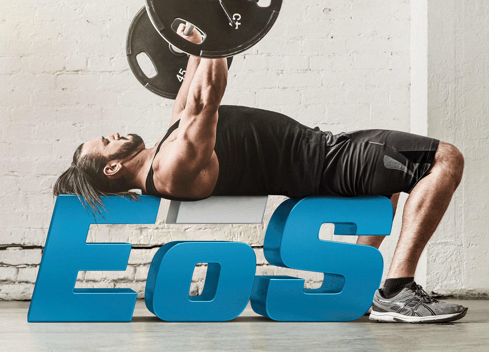
With this bench press photograph, removing the bench was less difficult than it looked after I recognized that the areas behind the new logotype did not have to be retouched, just the areas between the letters. I had to fake part of the model’s left leg and move the back of his head down a tad so it rested comfortably on the letter “E.” I added just enough reflection and shadow on the logotype of the man’s body and hair without cluttering it up.
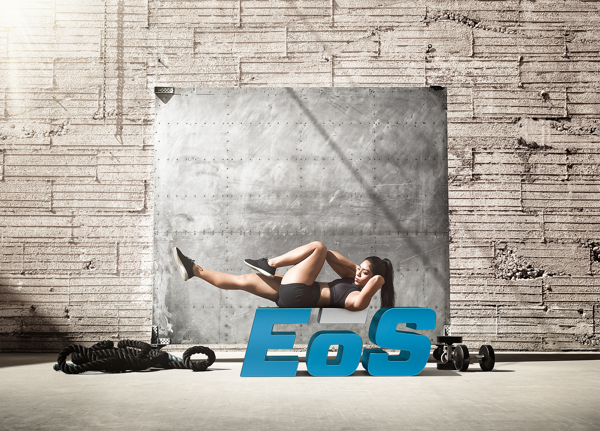
This floor had a little shine to it, so I captured the reflection of the logotype in Cinema 4D and blended it into the original photograph.
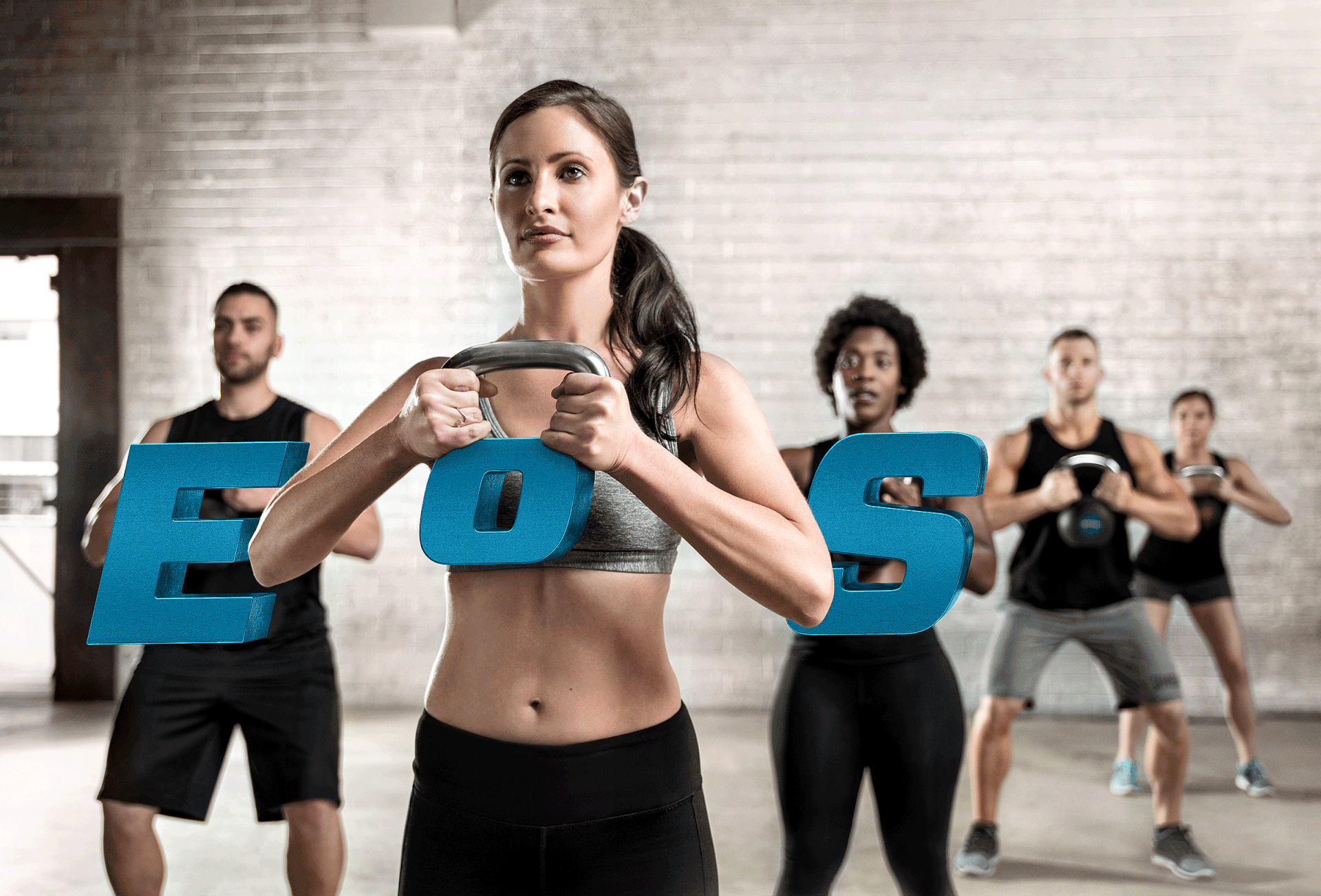
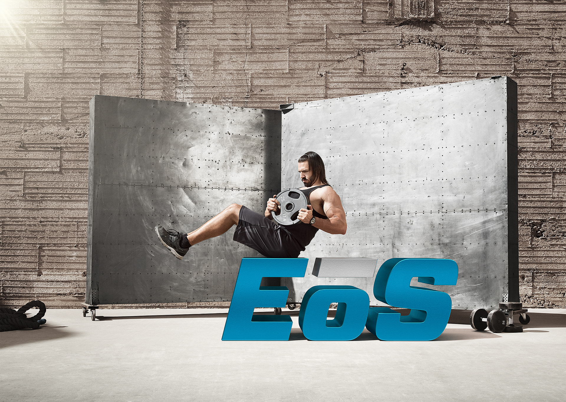
In some cases, delicate adjustments to the model’s hands had to be made with the help of Photoshop’s Puppet Warp feature.
The best news for a project as fun as this one was when it won a Bronze Addy Award for Poster Campaign! Great campaign concept and execution by everyone!